
Typography and Design Elements of the FIFA World Cup 2026 Logo
/The expanded 48-team format of the FIFA World Cup is underway. 104 matches played in total across Mexico, Canada, and The United States.
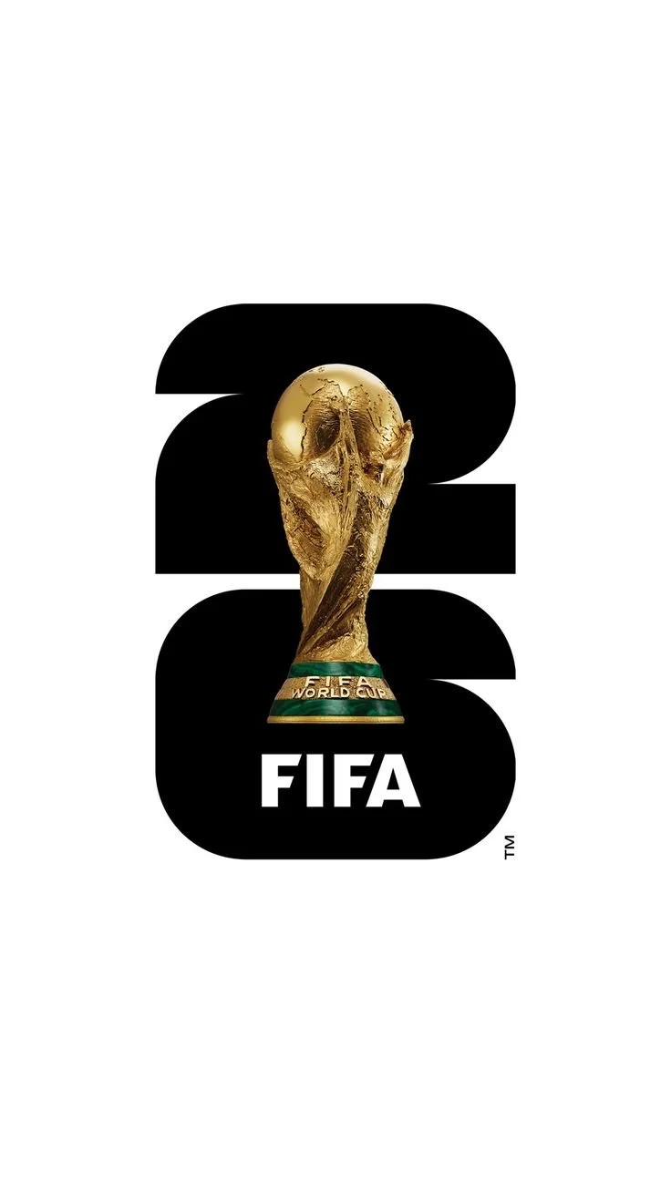
The increased number of teams and matches involved isn’t the only new thing about the tournament. You will have no doubt seen the logo for the World Cup - a simple 26 with an image of the famous trophy that Lionel Messi got his hands on four years ago in Qatar.
Most people look at a logo and see a simple shape. Graphic designers, however, see a series of deliberate visual adjustments that make the design appear balanced, even when it isn't mathematically perfect.
The FIFA World Cup 2026 logo provides a great example of two common optical adjustments used in professional logo design: overshoot and corner softening.
1. Overshoot: When Shapes Need to Be Bigger Than They Should Be
At first glance, the numerals in the FIFA World Cup 2026 logo appear perfectly aligned. However, if you were to measure them precisely, you would notice that the rounded portions of the "2" and the "6" extend slightly beyond the height and width of the straighter elements.
This technique is known as overshoot.
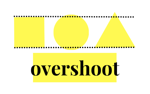
Our eyes naturally perceive curved shapes as being smaller than flat-edged shapes of the same dimensions. To compensate, designers intentionally make circles, curves, and rounded corners slightly larger. Without this adjustment, the rounded numbers would appear undersized and visually weak, even though they would technically be the correct size. The result is a logo that feels balanced to the human eye.
2. Softening Sharp Angles / Corner Softening
Another subtle adjustment can be found in the acute angles of the "2" and "6".
While it might seem logical to create perfectly sharp points, extremely acute angles can often look too aggressive, uneven, or visually distracting. They can also create printing and reproduction issues when the size of the image is changed.
To solve this, designers often soften or slightly round these sharp intersections. The adjustment is usually so subtle that most people never notice it, but it prevents the shape from appearing harsh and helps maintain visual consistency throughout the design.
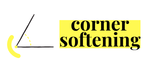
In the FIFA World Cup 2026 logo, these softened angles contribute to the smooth, modern appearance of the numerals while preserving their distinctive character.
Good Design Isn't Always Mathematical
One of the biggest misconceptions about graphic design is that it is simply arranging elements according to measurements and grids. In reality, professional designers regularly make adjustments that intentionally break mathematical rules in order to satisfy the way humans perceive shapes.
Overshoots, softened corners, optical alignment, kerning corrections, and visual weighting are all examples of techniques that help transform a technically correct design into one that feels right.
Why Hire a Professional Designer?
Many businesses assume that logo design is simply a matter of choosing a font and arranging a few shapes. What they often don't see are the countless optical adjustments happening behind the scenes.
A professional designer understands principles such as overshoot, corner softening, visual balance, spacing, and proportion. These details may seem small individually, but together they create the difference between a logo that looks amateur and one that feels polished, credible, and memorable.
If you're investing in your brand, working with an experienced designer ensures that these subtle but important details aren't overlooked. After all, your customers may never consciously notice them—but they'll certainly notice the difference.